blog
How strong visuals shape perception
Art direction

Ryan Zhang
zerohour ceo
5 min. read

Introduction
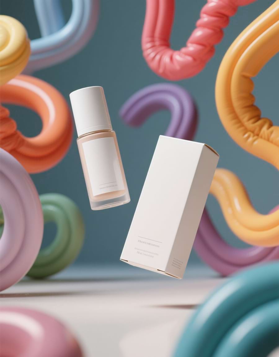
Visuals are more than decoration — they’re the foundation of how people understand, trust, and remember a brand. Before a single word is read, visuals set the tone, frame expectations, and signal what an experience will feel like. Strong design doesn’t just catch attention; it tells a story instantly.
Humans process images faster than text, which means every color, shape, and composition becomes a shortcut for meaning. Clean typography communicates clarity and reliability. Bold color palettes express confidence and energy. Thoughtful spacing suggests calm, precision, and quality. These choices quietly shape how people perceive value long before they interact with your product or service.

Understanding the Power of Visuals
First impressions happen instantly, and visuals are the first language people respond to. Before any text is read, design choices set expectations, communicate quality, and establish the emotional tone of an experience. Color, layout, contrast, and composition all work together to create a sense of presence that users feel within seconds. Strong visuals give users an immediate sense of clarity and confidence, helping them understand the brand without a single word.
When visuals are intentional, they create trust and guide users toward what matters most. They make digital experiences feel polished, memorable, and thoughtfully crafted. Good design doesn’t just decorate — it communicates. It sets the stage for everything that follows and ensures users are engaged before they even start reading.
Design as a Meaning-Maker
Every element communicates something—color, typography, spacing, scale, motion. Even the smallest detail carries meaning and shapes how users interpret a brand. Clean lines and generous spacing feel intentional, balanced, and trustworthy, creating a sense of clarity that invites people to explore without hesitation. Bold palettes feel expressive and energetic, signaling confidence and personality while making a strong visual statement. Subtle gradients and soft shadows feel modern, refined, and digitally native, giving interfaces dimension without overwhelming the experience.
These choices act as shortcuts for meaning, influencing how people perceive value and credibility before they interact with anything. Users instinctively pick up on these cues, forming impressions long before they read a headline or click a button. When visual decisions are aligned and purposeful, they build trust and create emotional resonance. When they’re inconsistent, they create doubt. Design isn’t just decoration—it’s communication, and every choice plays a role in shaping how a brand is understood.
Creating a Consistent Visual Narrative
Visuals become powerful when they work together with purpose. A cohesive system reinforces identity across every touchpoint and creates an immediate sense of familiarity. When colors, typography, layout, and imagery follow the same rules, users move through the experience without confusion or hesitation. Consistency removes friction, strengthens trust, and makes every interaction feel deliberate and aligned with the brand’s voice.
When design matches the story a brand wants to tell, people connect faster and remember longer. Visual harmony turns simple interactions into meaningful impressions, helping brands stand out in a landscape crowded with constant noise. Strong visuals aren’t just an advantage—they’re a necessity. They define how a brand is perceived, shape emotional response, and ultimately determine whether users stay engaged or move on.
Design That Builds Emotional Connection
Great visuals do more than inform—they create feeling. Emotion-driven design helps brands establish trust, warmth, and personality without relying on heavy copy. Whether it’s through color, movement, or composition, emotional cues shape the way users interpret the experience from the very first glance. When a visual system sparks the right feeling, the brand becomes more relatable and memorable.
Thoughtful emotional design also guides user behavior. It encourages engagement, supports storytelling, and reinforces the character of the brand. When aesthetics align with emotion, the experience becomes intuitive and meaningful instead of merely functional.
Consistency as a Competitive Edge
In crowded digital spaces, consistency is one of the strongest differentiators a brand can have. Unified visuals help users recognize a brand instantly across pages, platforms, and contexts. When everything matches—from typography and spacing to color and imagery—the entire experience feels more polished, professional, and trustworthy.
Consistency also simplifies the user journey. It reduces cognitive load and makes navigation feel natural because each element behaves as expected. A well-aligned system shows discipline and purpose, qualities that users subconsciously associate with credibility.
Closing Thoughts
Visual design is more than aesthetics—it’s a language. When used intentionally, it guides attention, communicates values, and strengthens identity in ways words alone never could. A cohesive visual system gives brands the power to speak clearly in a world full of noise. Strong visuals don’t just elevate a product; they elevate perception, trust, and the entire experience surrounding it.